Illustrating with Light
The City of Light project is the brainchild of Waterford City and County Council. Together with funding from Failte Ireland, the council has developed an innovative city trail to highlight Waterford city’s historic buildings, creating an exciting and enticing after-dark experience for visitors. The trail illuminates the night streets twice a year, symbolically at the seasonal junction of Samhain, when daylight starts to recede and again at Imbolg, when days begin to lengthen.
“The ‘City of Lights’ represents a pivotal moment for Waterford, blending technology, history, and artistry. Our team has meticulously designed this trail of light to create immersive experiences, connecting the city’s historical treasures with the present.”
Ali Jay, Project Manager with Waterford City and County Council at the project launch back in 2023
Samhain
In early 2025, along with several other artists, I was asked to collaborate on the City of Light project. My designated canvas was the facade of the Presbytery building on George’s Street for the duration of the city’s Samhain celebration in October of the same year.
Inspiration behind Samhain Illustration
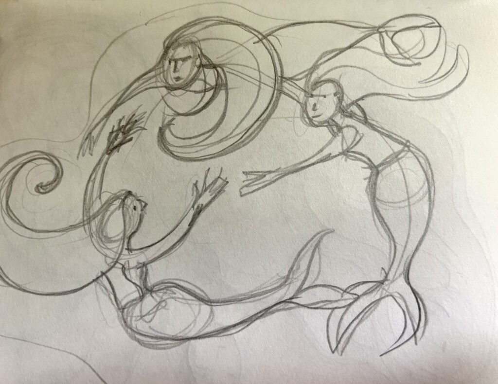
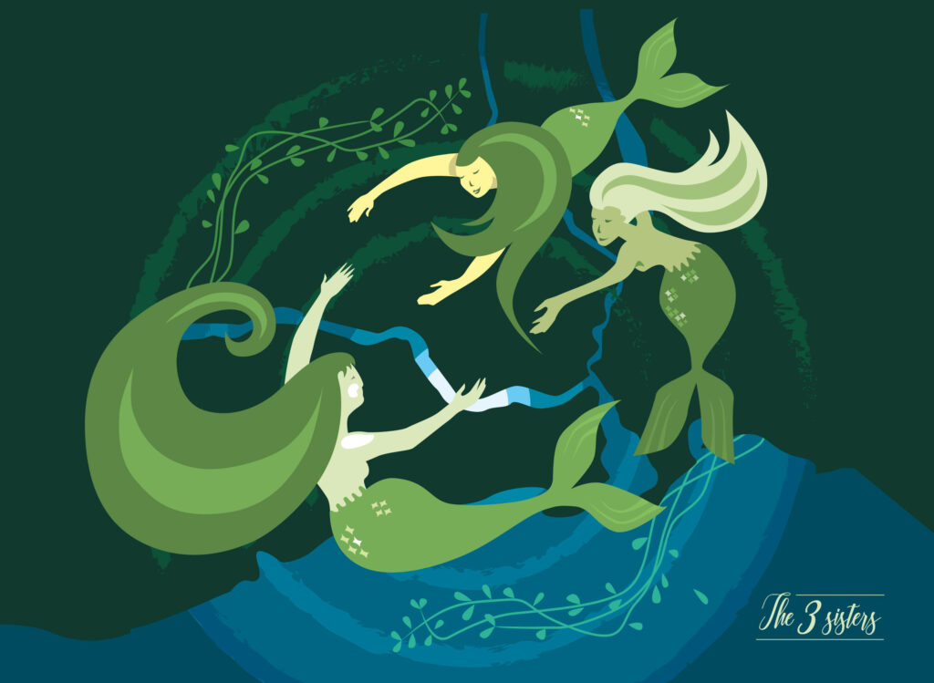
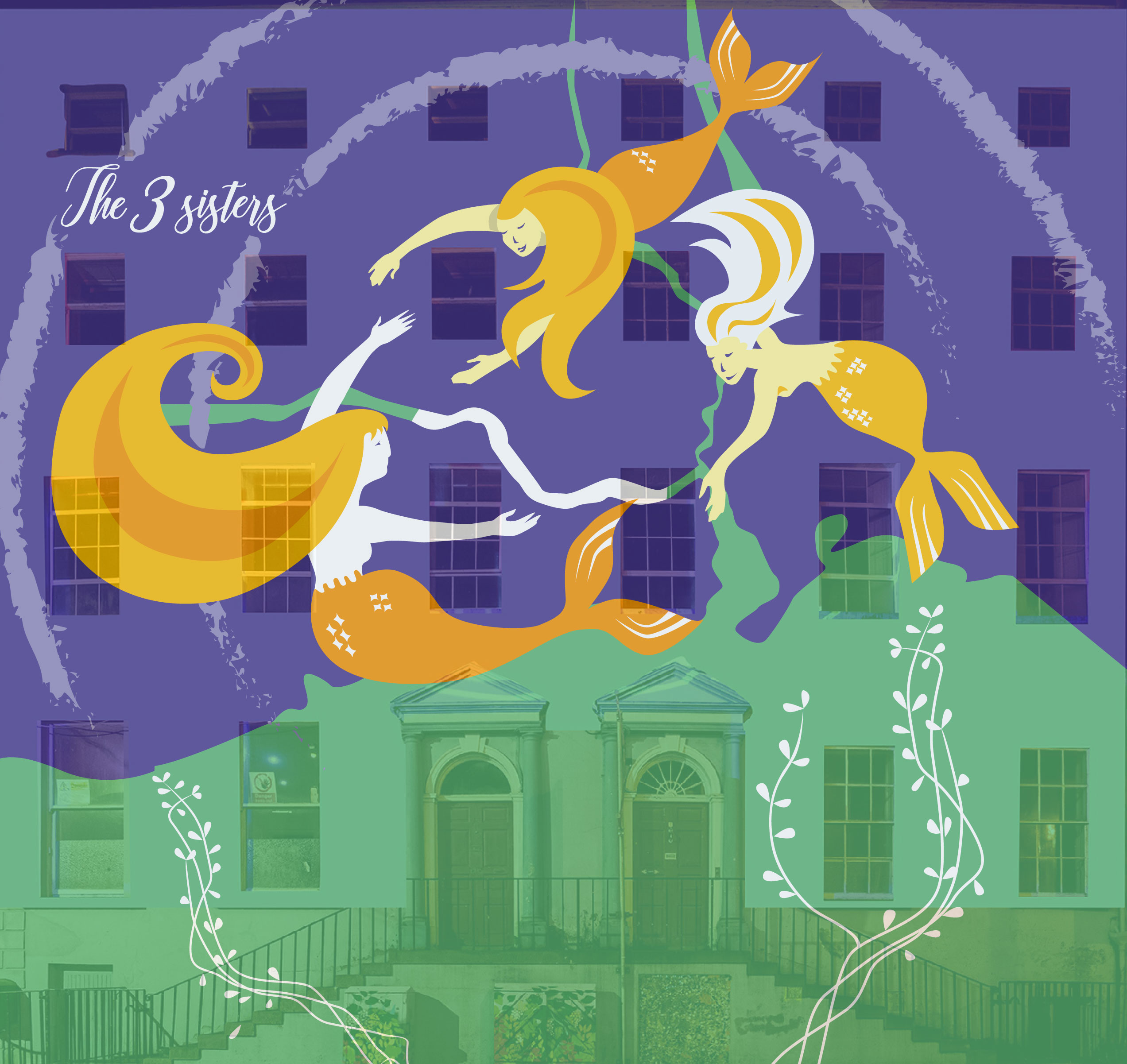
For my contribution to the project, I reimagined the River Suir’s vital role in shaping Waterford City’s cultural, historical, and social landscape over the centuries. Just as it has in the past, the river continues to define the city and the people who call it home. My piece, titled “The 3 Sisters”, depicts the Suir and its sister rivers — the Nore and the Barrow — as water spirits, symbolising togetherness, collaboration and the strength that flows from shared heritage and creativity.

Painting with light – a learning curve
As I had never created an illustration for a light installation, I met with some minor challenges. Certain colours, I learned, don’t translate well when projected as light, especially onto masonry. Designing with light offers less flexibility than designing for print, so it was essential to make the colours more vibrant and in-yer-face, with plenty of contrast so the image would pop. The light doesn’t pick up much fine detail or texture. My original design was darker and more subdued (see below), and atmospheric as it was, it would have been completely lost on the building.
Secondly, placing the main parts of the image over windows makes no sense, as the glass panes don’t reflect the light very well. Note the numerous windows on the Presbytery facade… George’s Street is quite narrow and the presbytery quite large; so the image is projected from two projectors positioned at an angle (not straight-on), adding further complication to the process for the technicians managing the installation. After extensive discussion with the technical staff at Fantasy Lights, I was able to alter certain elements of the illustration to showcase the projected image at its best. It was an enlightening experience, in more ways than one, and I was thrilled to be involved.